Founding and designing Pinterest’s internal conference
At Pinterest, to “knit” means to collaborate with someone from another discipline. When asked to create a cornerstone cultural event for the company, we knew it needed to be about sharing ideas, so I suggested an event where any employee could teach a class on any topic (co-founder Evan Sharp added that we should also host external speakers like Diane Keaton, David Chang, and Stewart Brand).
Pinterest employees are fascinating, well-rounded overachievers, and giving them an opportunity to express their passions at work led to incredible results. People taught classes on topics like drag makeup, intersectional feminism, finding your spirit animal, kitesurfing, and so many more. And more importantly they felt supported in bringing their whole selves to work. As a result it ended up with an approval rating 95% or above every year, and the CEO mentioned it in a talk he gave as one of the most important moves the company made to keep its identity during a period of major growth.
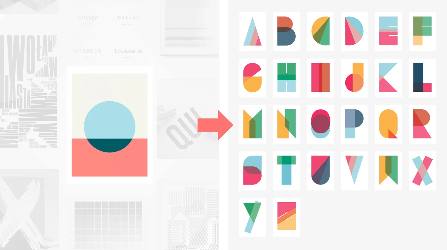
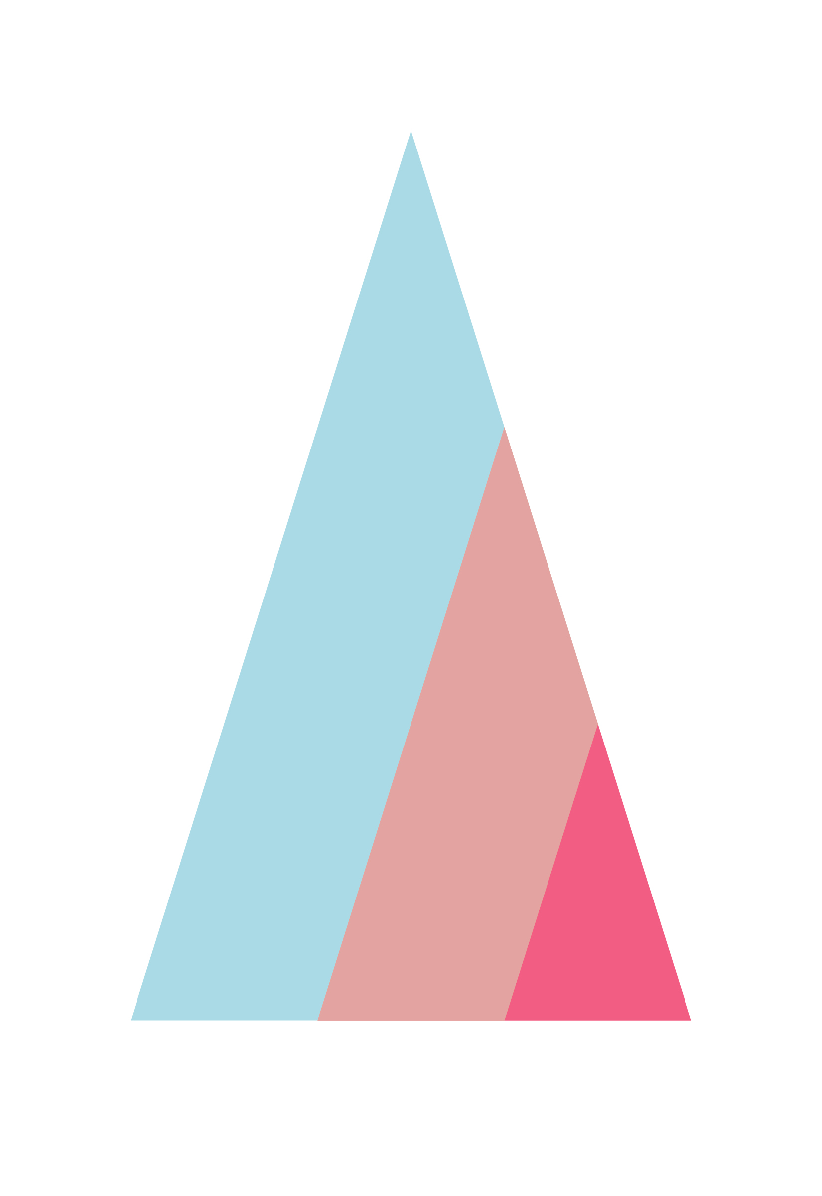
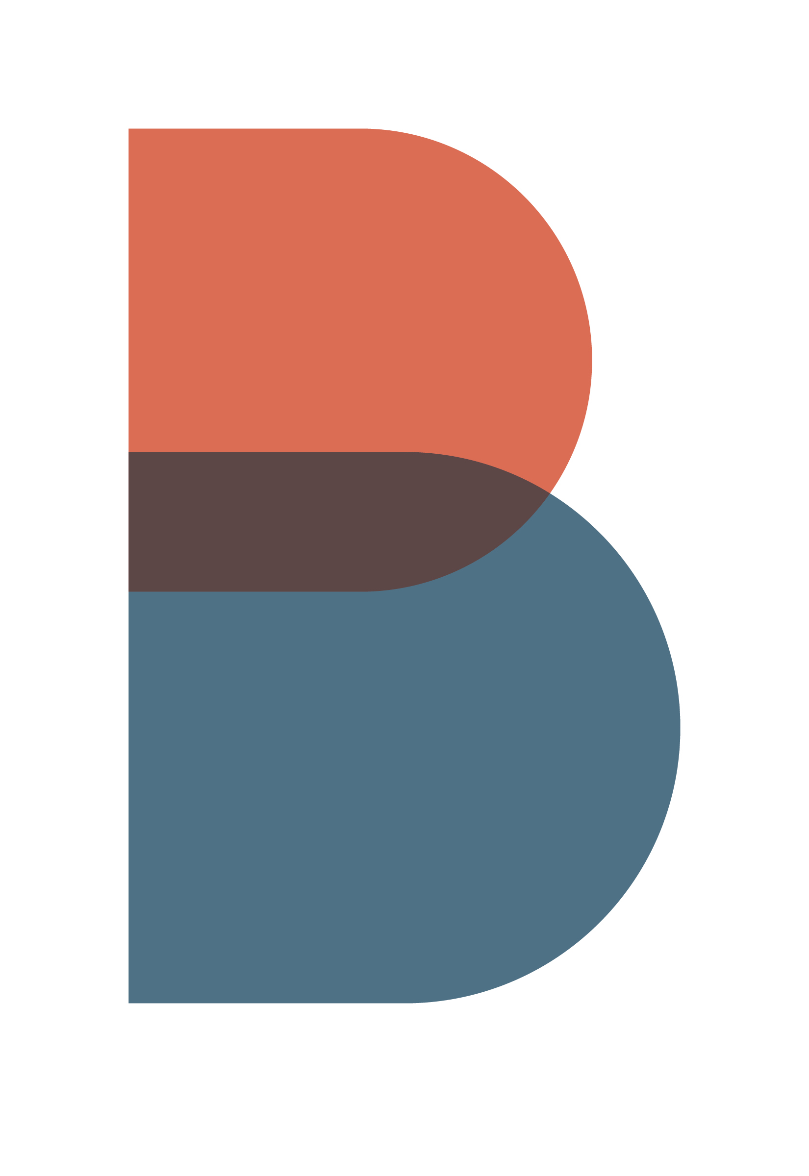
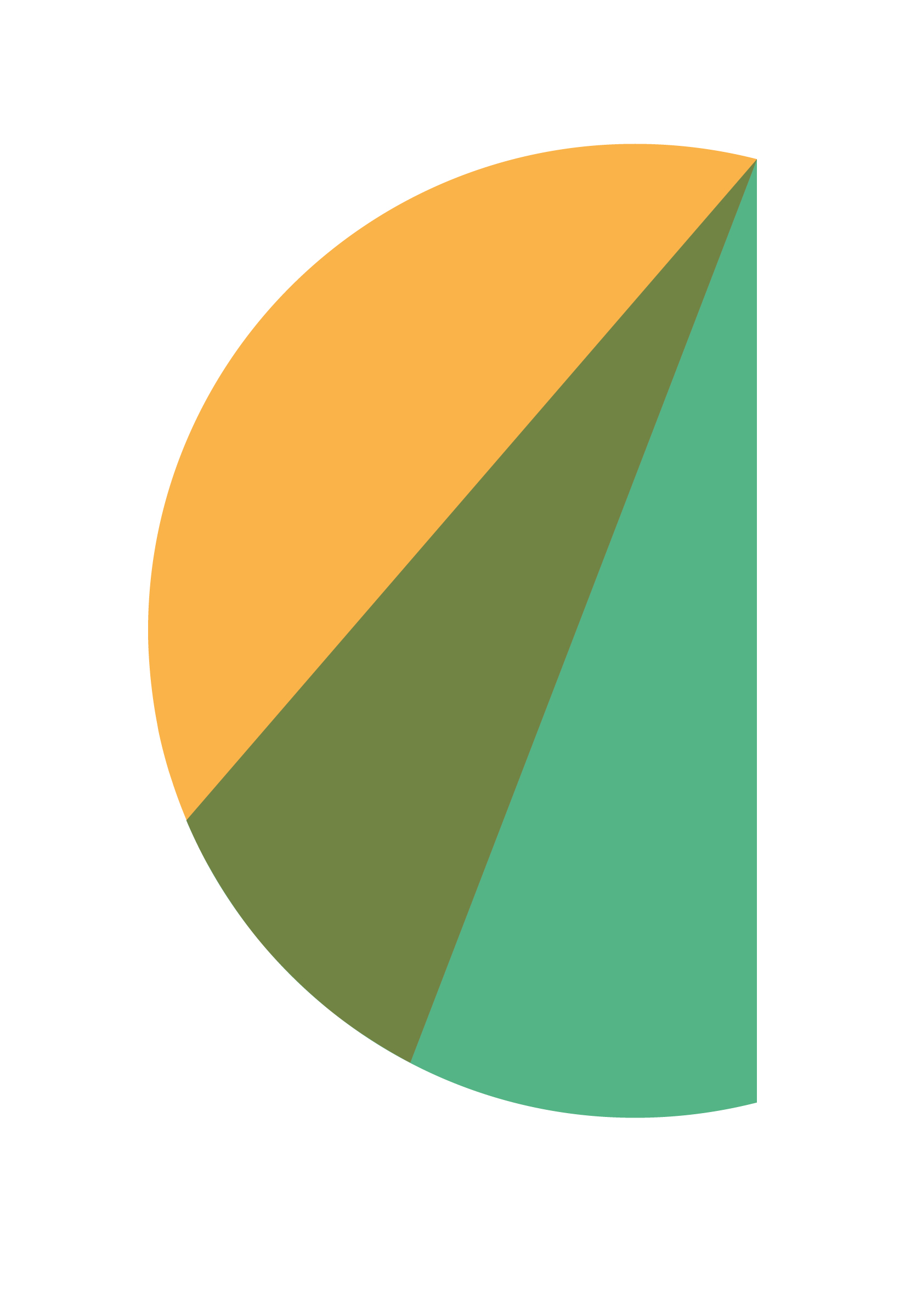
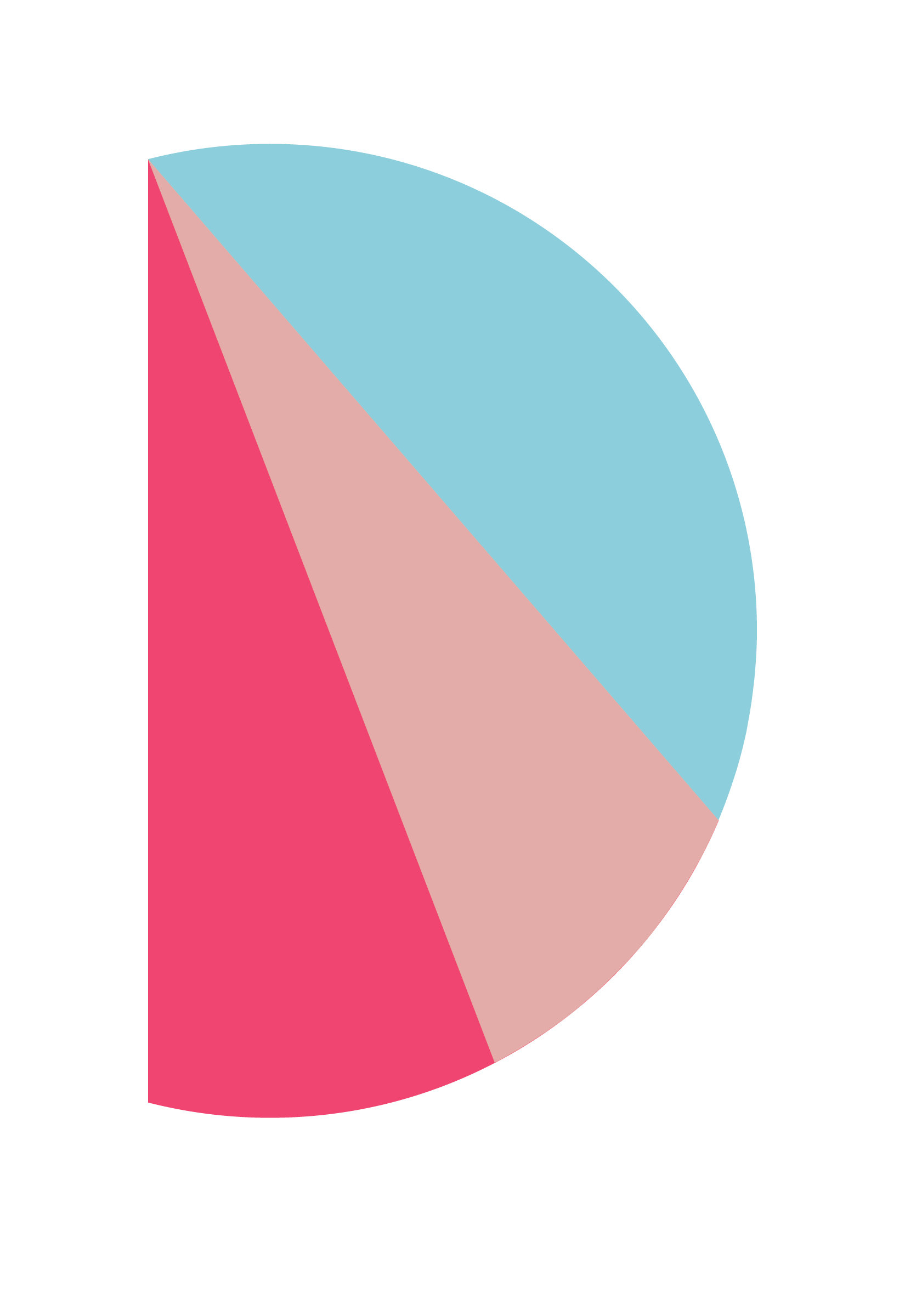
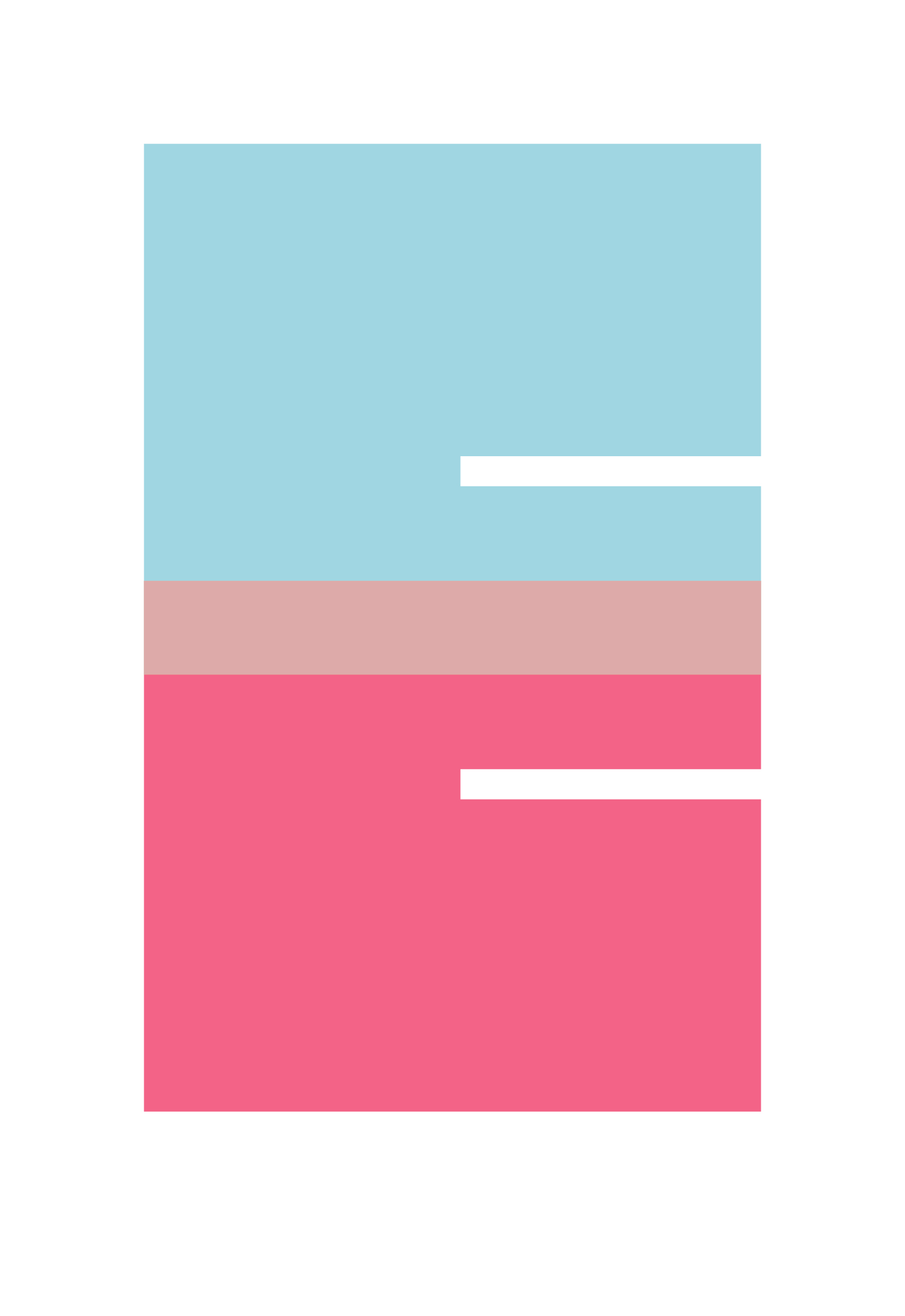
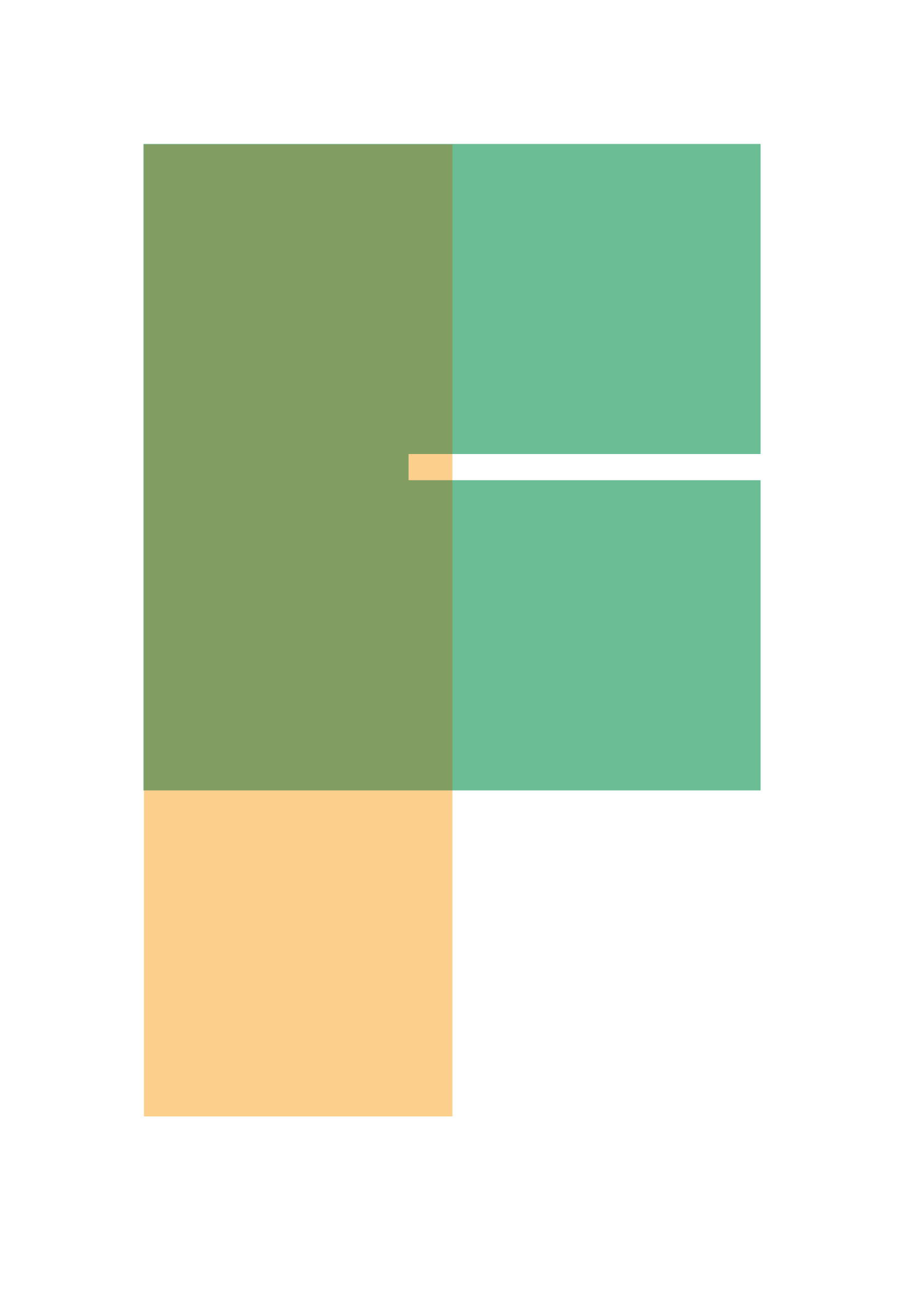
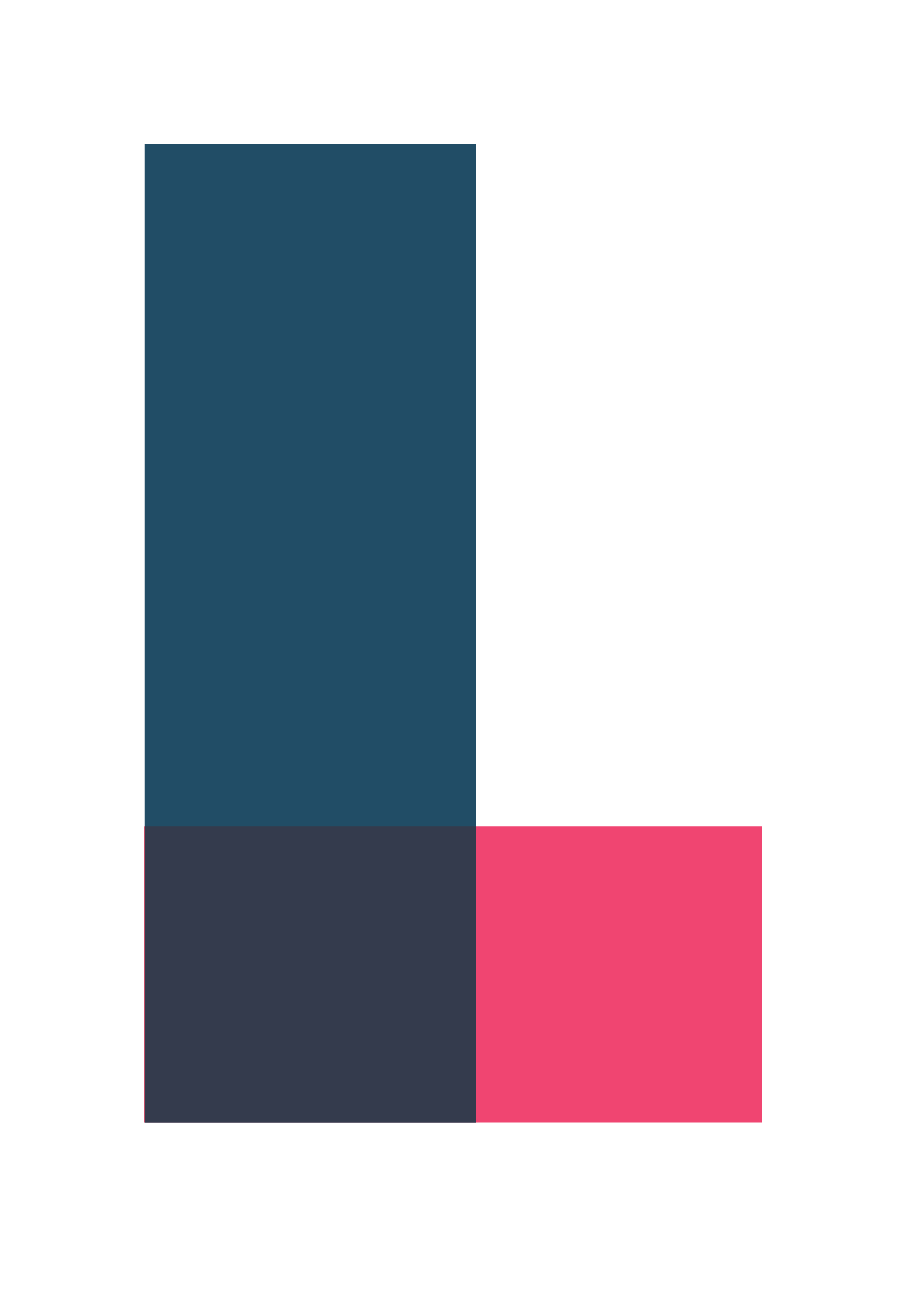
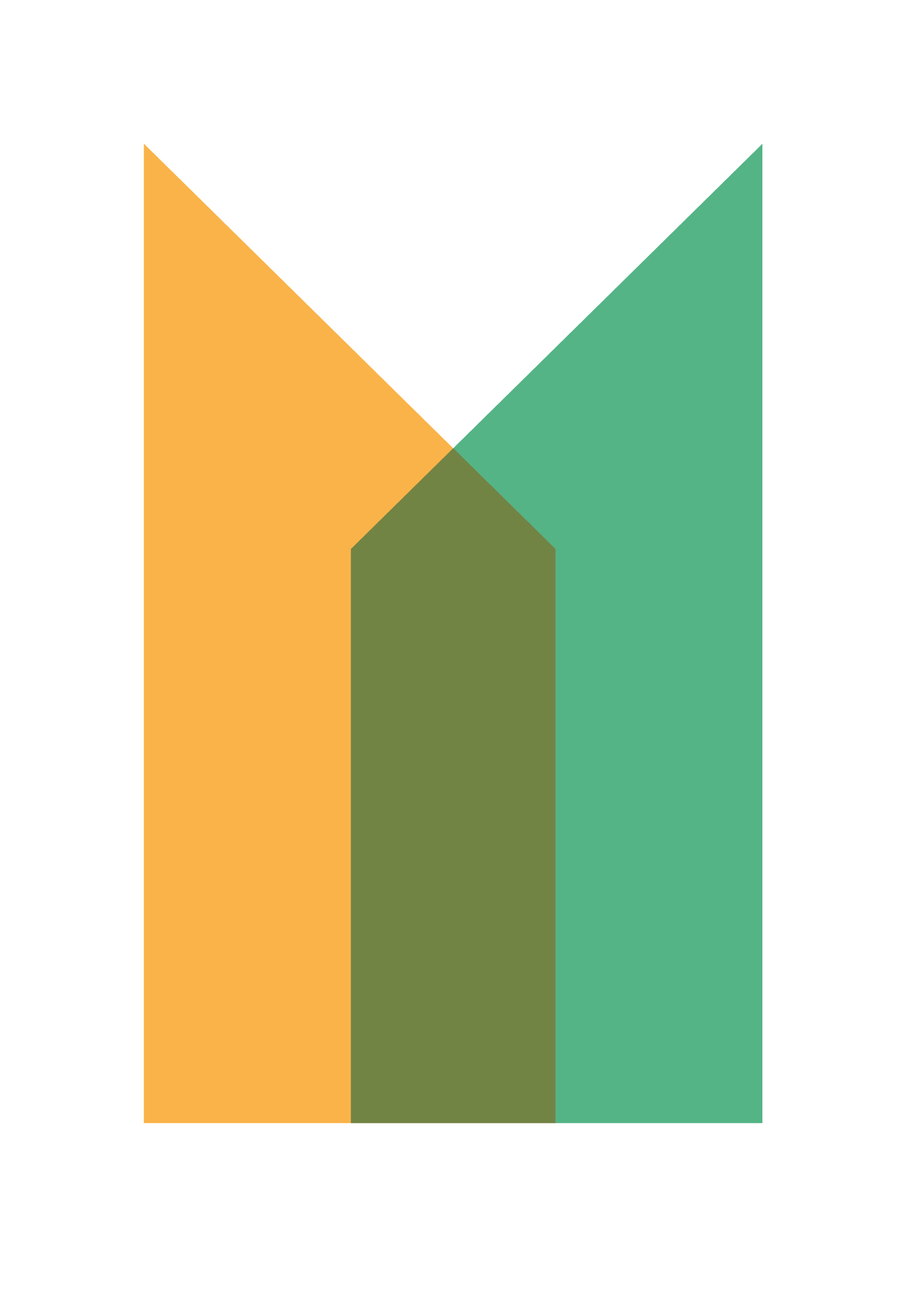
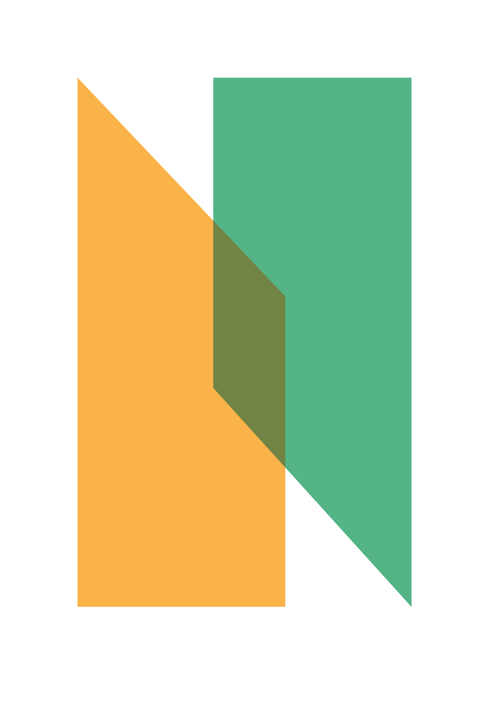
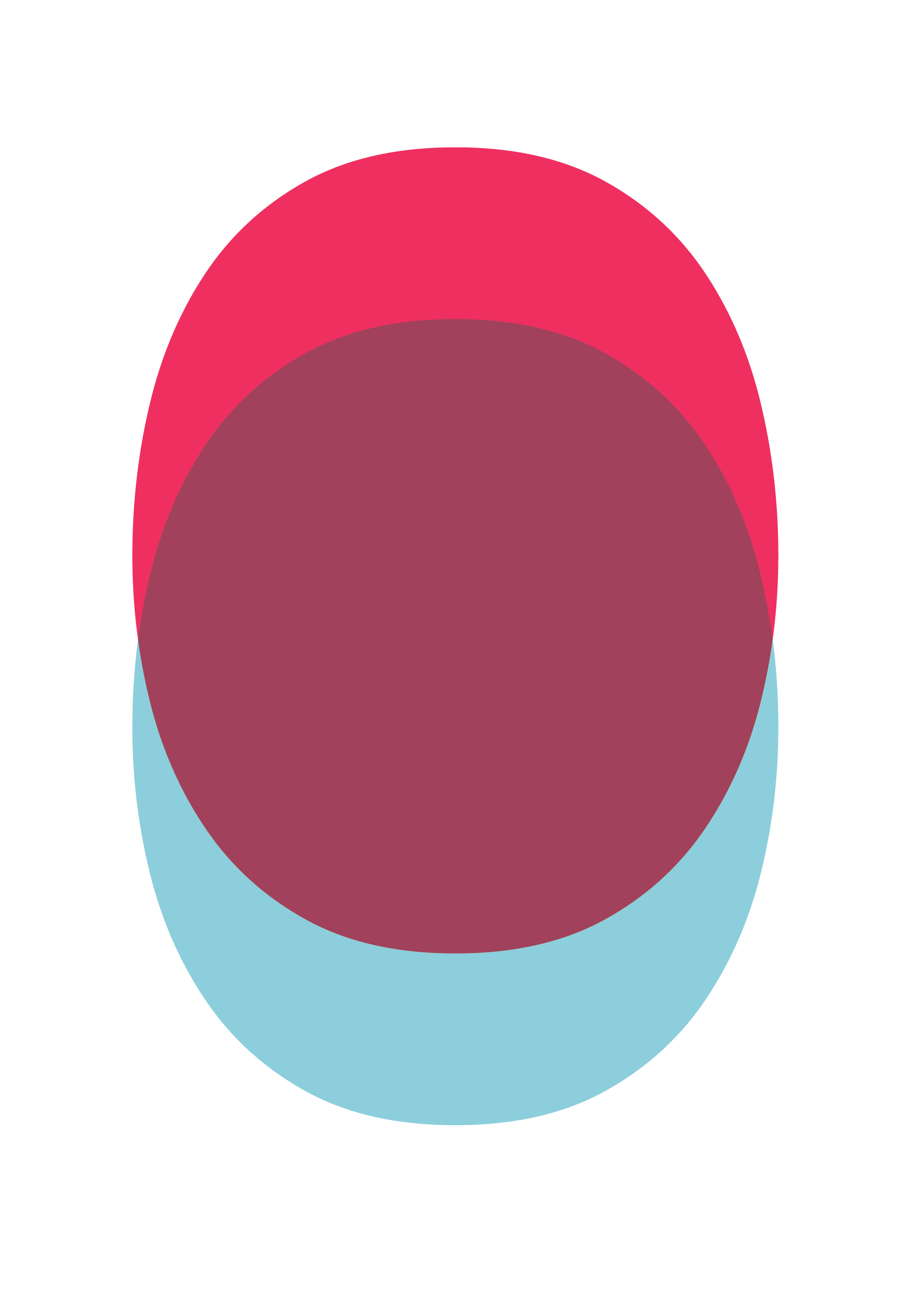
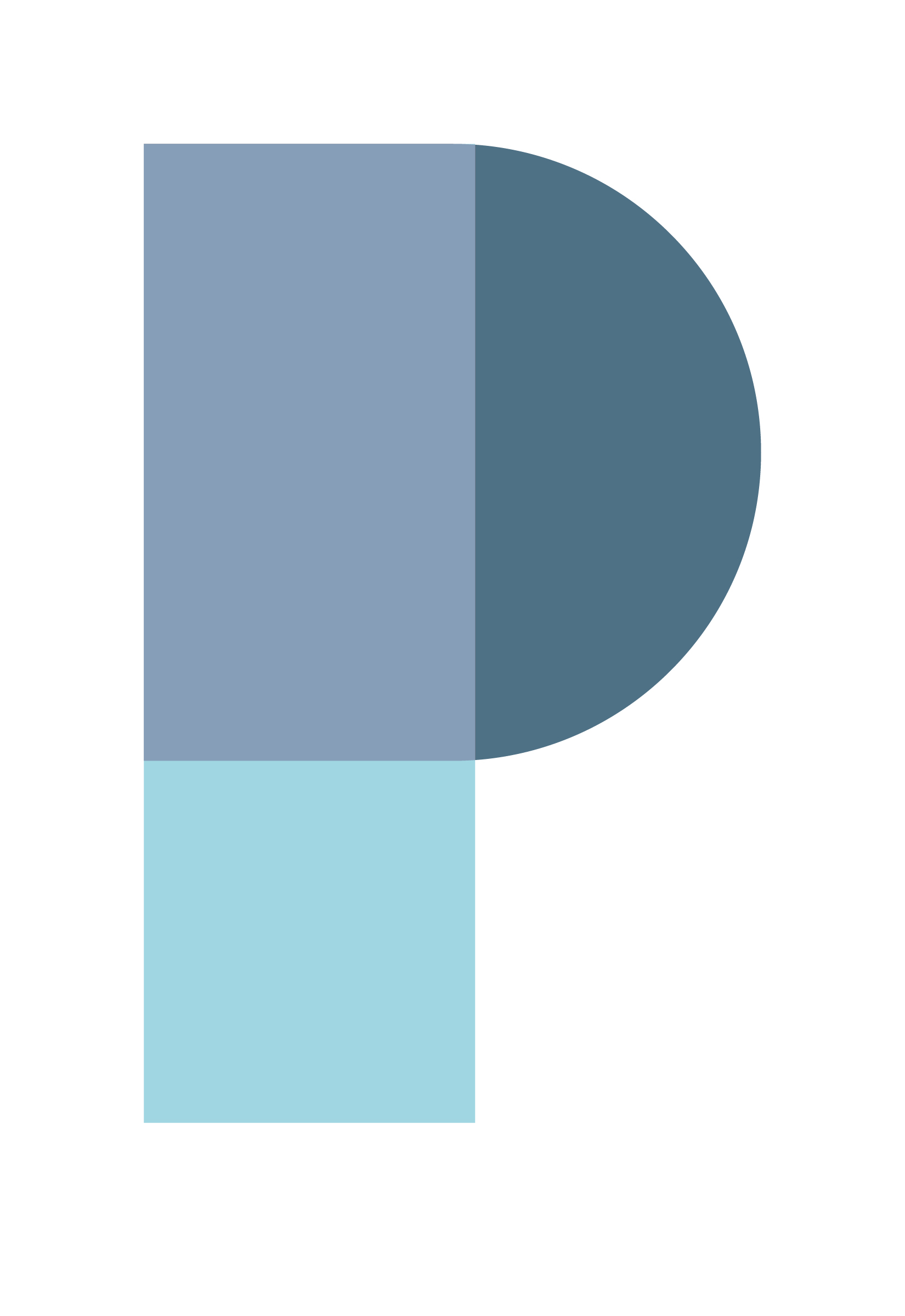
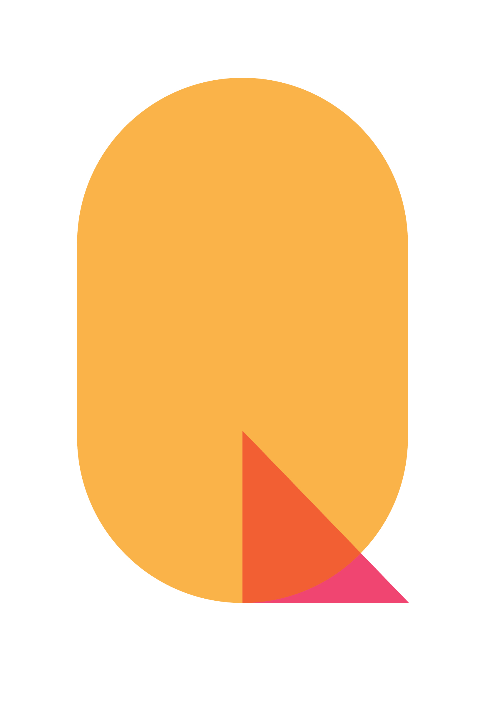
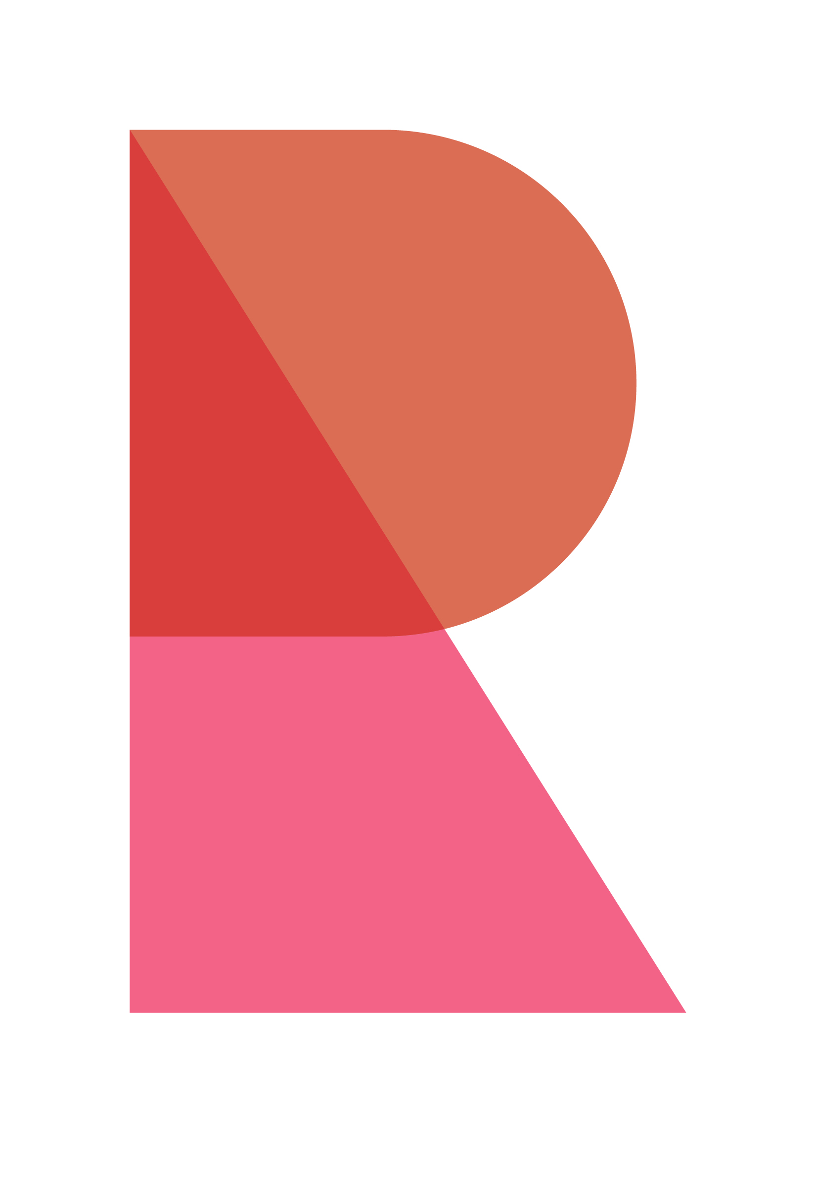
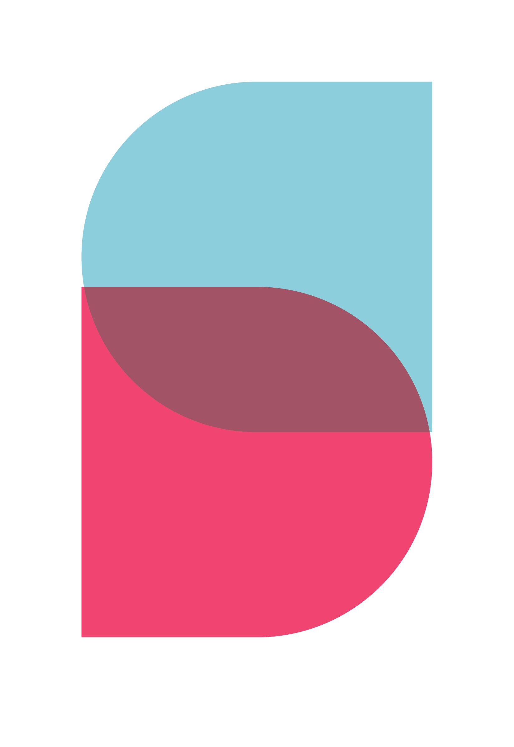
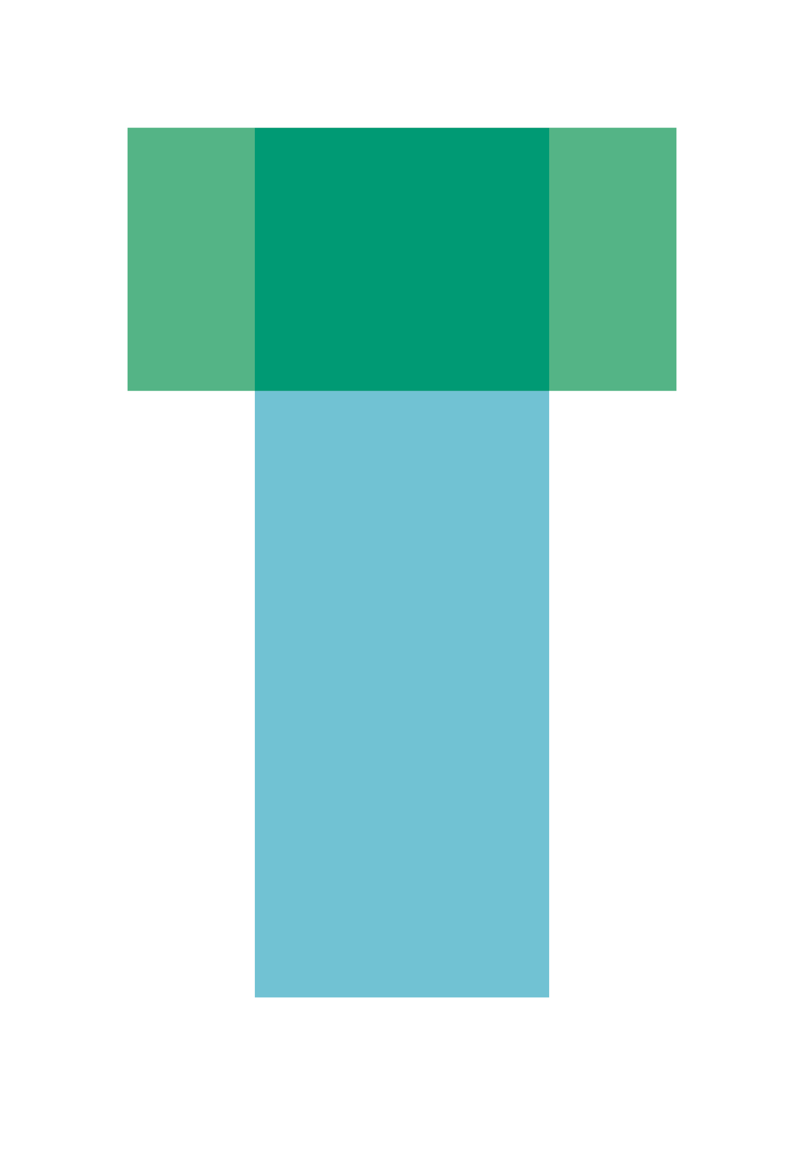
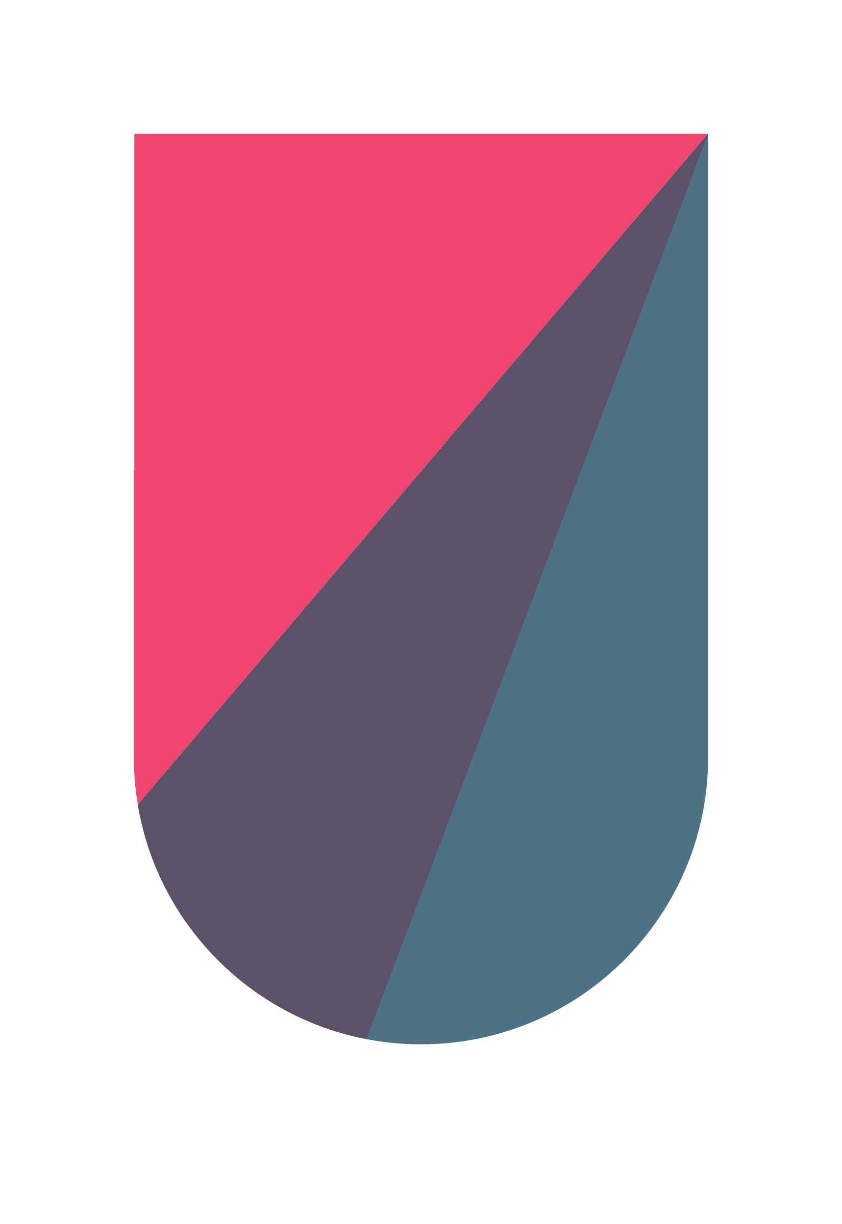
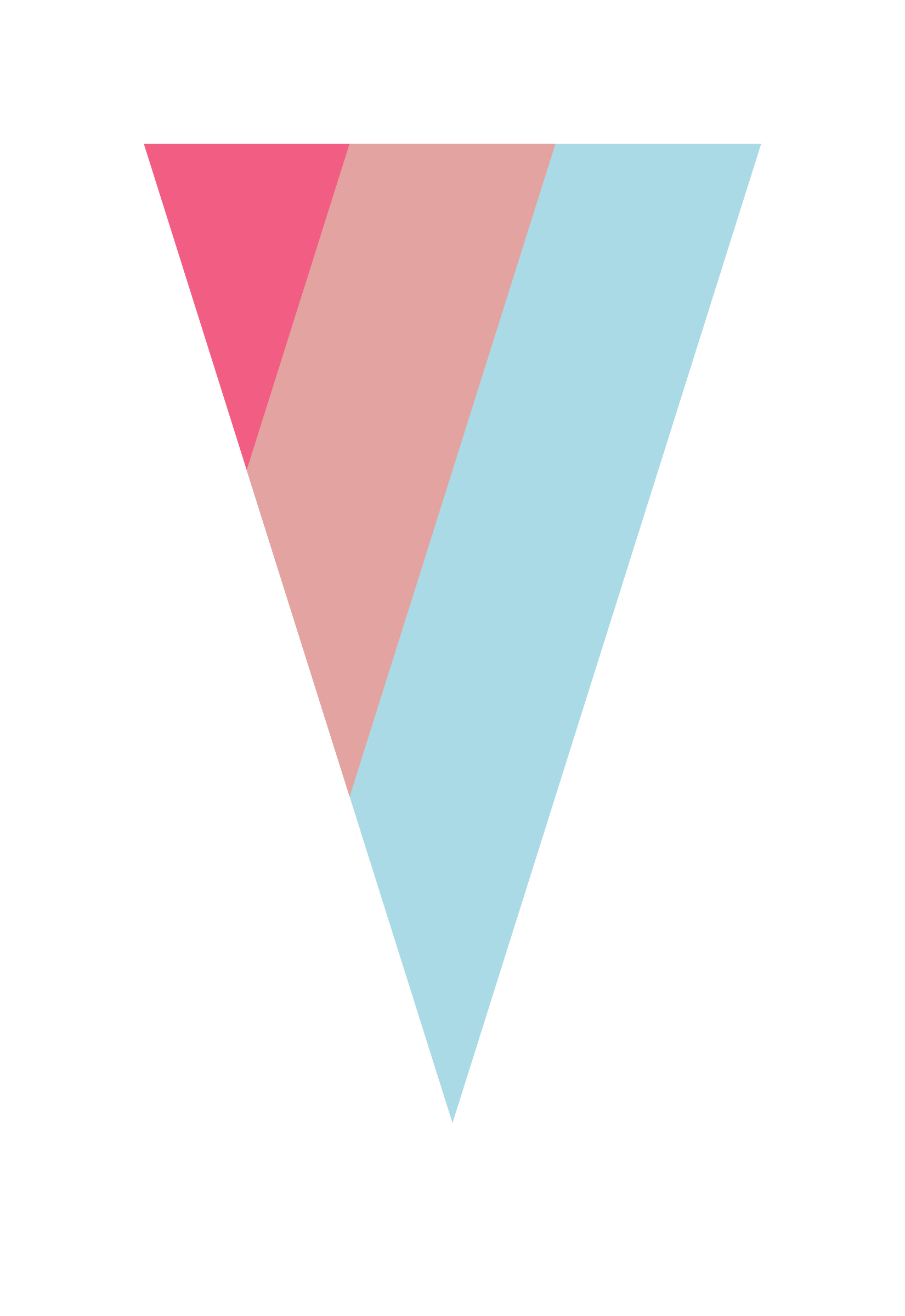
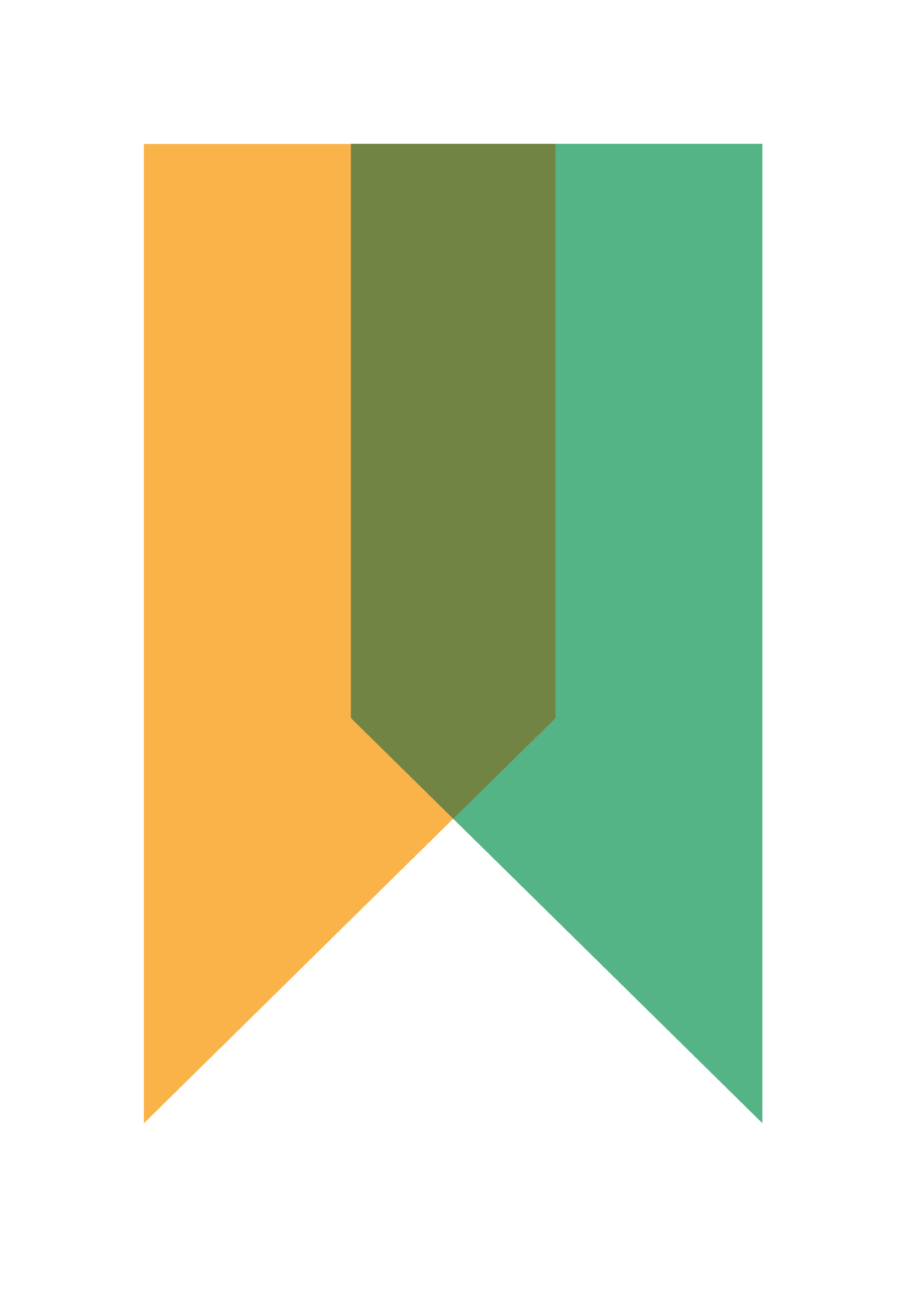
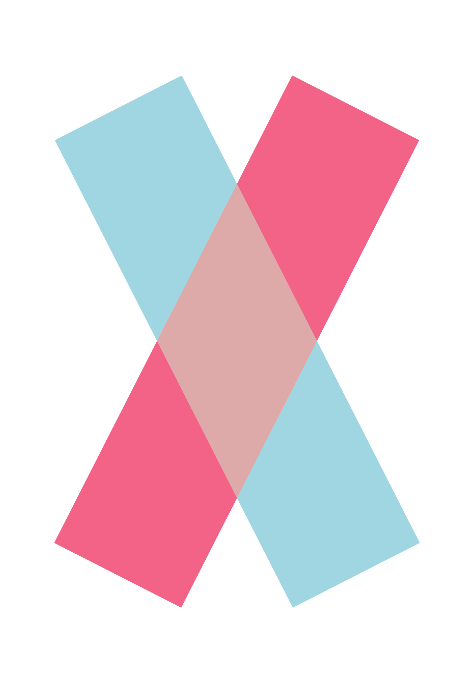
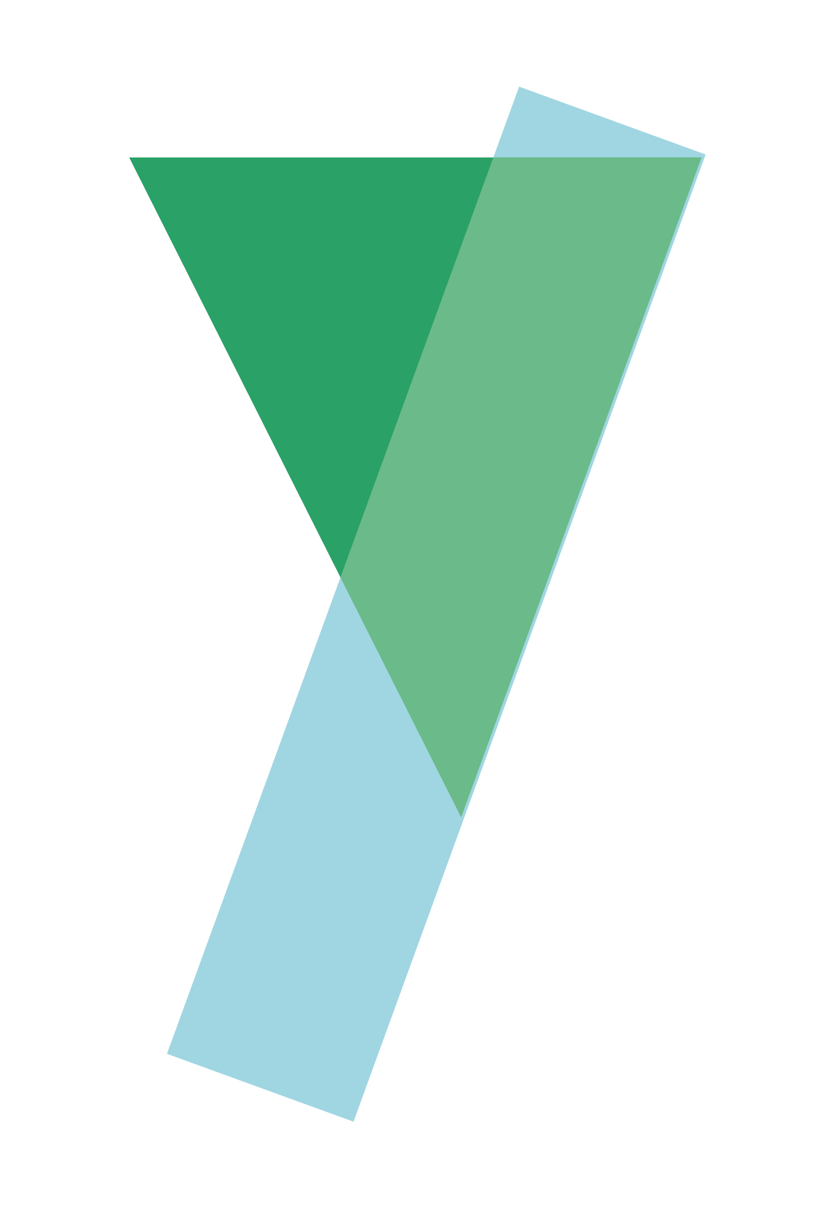
Knit Con alphabet I designed with assists from teammates.
Design origins
So many great things start as Pinterest Pins. I spotted this beautifully simple image of overlapping shapes in a co-worker’s feed and felt like it spoke to the idea of collaboration. This image inspired me to create a custom alphabet of overlapping shape letters, to symbolize the sharing of ideas across disciplines (right). Having a tight design system to build from helped me move fast in subsequent years of the event.
Initial Event
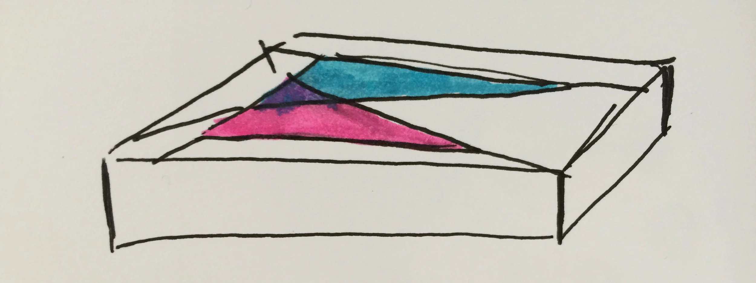
Having this special conference event in our normal workplace would necessitate changing the feel of the office somehow to make it special and different. Luckily, we had 9-foot skylights I had been waiting to use, so I started experimenting with plastic.
My SAT math skills went to good use along with the construction knowhow of my installer Jon Stevens. He thought up a way to weave plastic letters taller than me into a wire grid to create a nest for them.
The skylight installations created large colored projections onto the floor and added a lot of magic to the 2015 event.
The Second Year
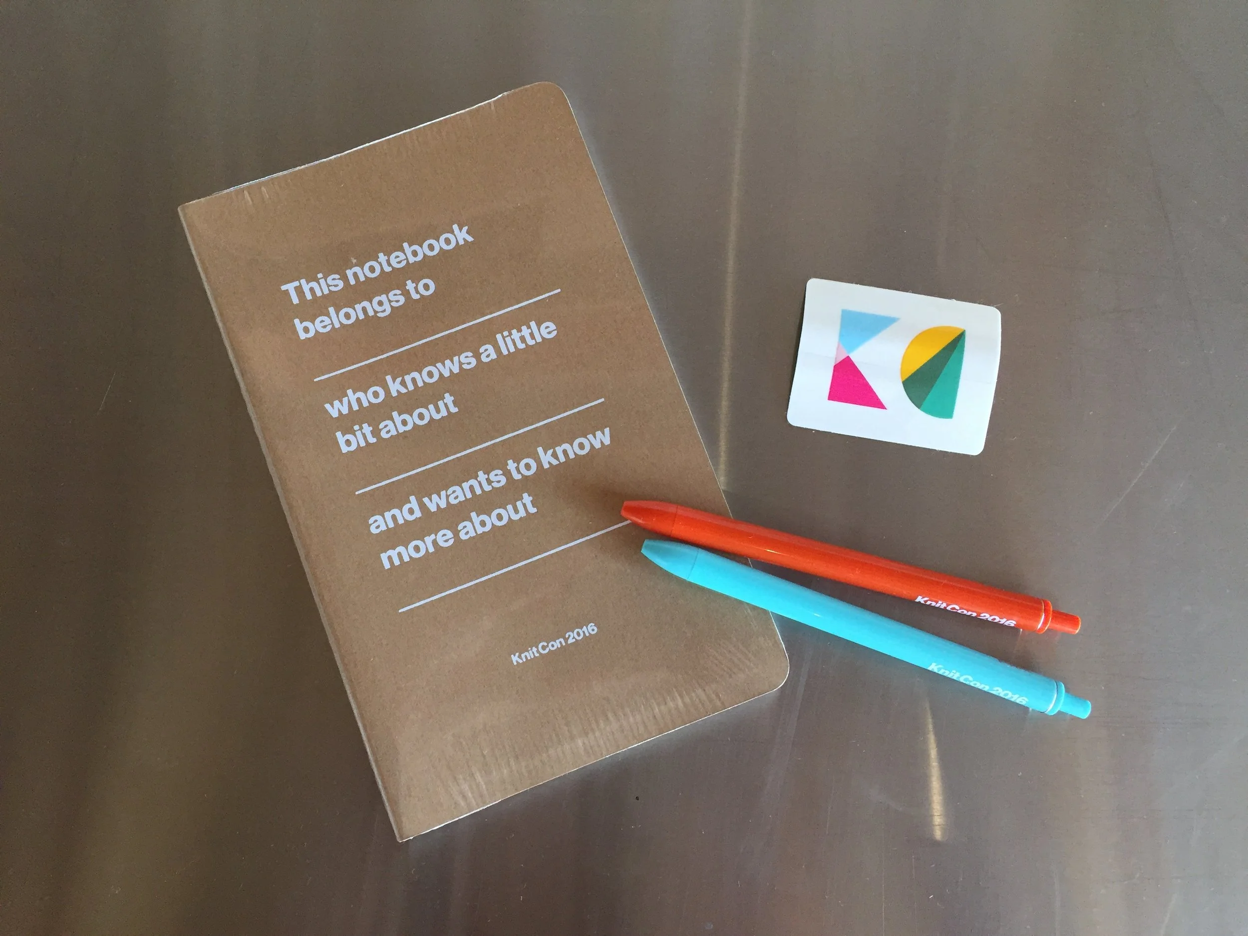
Knit Con 2016 gathered 700 people from offices all around the world. The colored sunlight coming in from the skylights and windows at the first event had felt like the most successful part of the 2015 design system, so we carried it over, along with the alphabet.
In order to reinforce the idea that each individual’s voice and identity is important, we spent a silly amount of effort creating name tags and tote bags with each employee’s initial as the graphic. Feedback like “This is the first time I’ve not thrown away my swag bag” or “I’ve never owned anything personalized to me before” made us feel like we’d created something of value to the recipient.
The brave employees willing to teach sessions about everything from discovering your spirit animal to tying a bow tie were our heroes. We honored them by putting each of their first names into a graphic covering the giant wall behind the stage. A complementary pattern made of the topics one could geek out about at Knit Con (watercolor, drag make-up, kitesurfing, etc.) graced the front entryway.
The Third Year
The 2017 event went into new graphic territories of geometric pieces of the original alphabet, with an event tagline line of “It’s not about the pieces, but how they work together.”
We made a number of new elements, including a custom geometric sticker sheet inside the notebook that allowed for people to personalize their gear. The 1” buttons allowed people to do the same with their hats.
The workplace team eventually put the kibosh on skylight installs they'd allowed in previous years, but the modular sculptures I custom designed and had laser cut from ecoboard were a great replacement. They were inexpensive and yet had a large footprint, and were reusable and recyclable.
The stage graphic I designed.
Hrishikesh Hirway from the podcast Song Exploder.
Next, read about a live art event at the SFMOMA that I creative directed and produced.
