

Identity and collateral design for an electric bike festival — on a tight budget and timeline
I figuratively fell out of my chair when I heard about the opportunity to do event design for an electric bike festival. WHAT! Even better, the folks putting it on were the design-minded and influential folks at The New Wheel electric bike shop, where I had purchased my my own prized possession electric cargo bike three years prior.

Having the opportunity to evangelize a car-free lifestyle in an optimistic and positive way was too good to pass up. Plus, when I suggested we give it a snappier name than “Electric Bicycle Festival,” they totally bit on “Super Bicycle.” I spent weeks pinching myself.
Their budget was tight so we kept the timeline short, but in three weeks I was able to help them with brand consultation (naming, intros to partners and sponsors, positioning, audience conversations, etc.), identity work (logos, color palette, type system), and collateral (poster, postcard, t-shirt, sticker, enamel pin designs). They wanted the work to balance between the fun feeling of the circus with a heavy dose of Northern California magic.
We immediately liked the way the letter forms fit together in Adelle Sans heavy, but it was feeling too precise and rigid for what the brand wanted to be.

So along with sampling other typefaces, I tried a few things with this lockup.
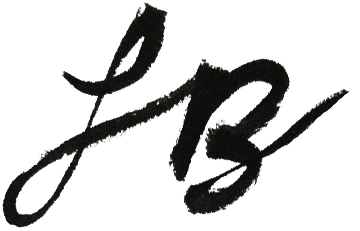
1. Tracing the lockup with permanent marker. (I used my kids’ pad of newsprint paper and a sharpie for this.)


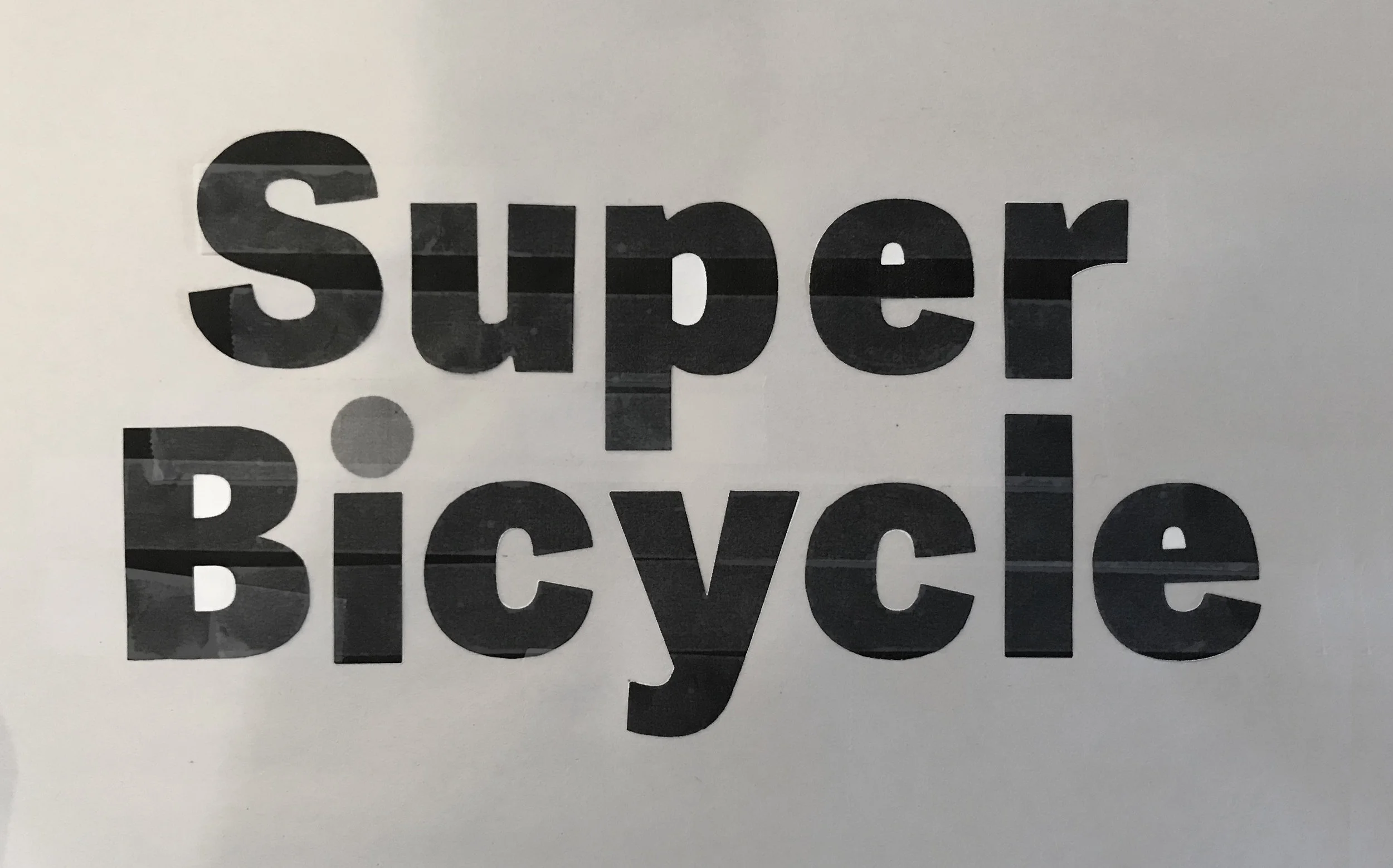
2. Cutting out each letter and taping them back together before scanning them in.

3. Perspective shadow text to bring in that SUPER feeling.
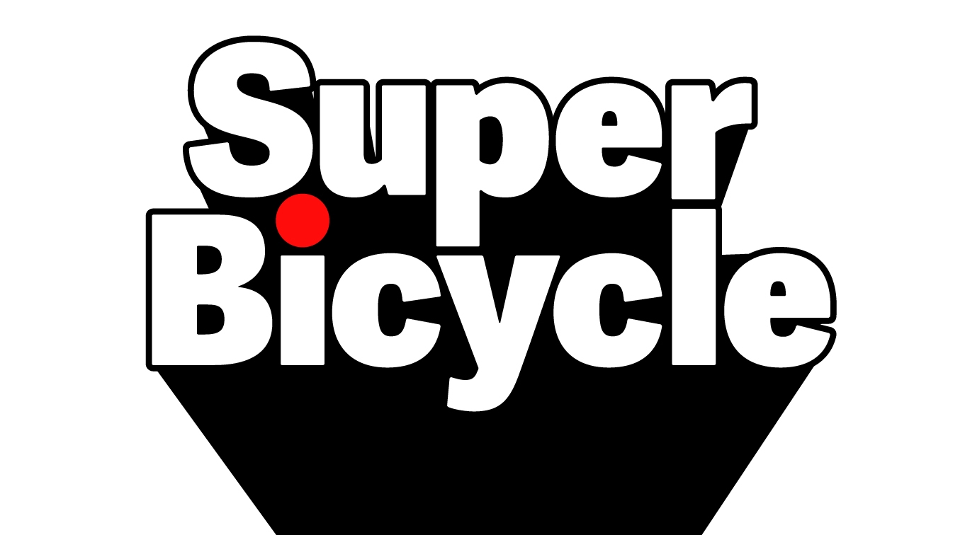
My client ended up loving the friendliness and approachability of the cut-out-letter version of the Adelle Sans lockup, and also the sense of drama and magic afforded by the shadow behind. (They also asked me to add an illustration of a bike.)
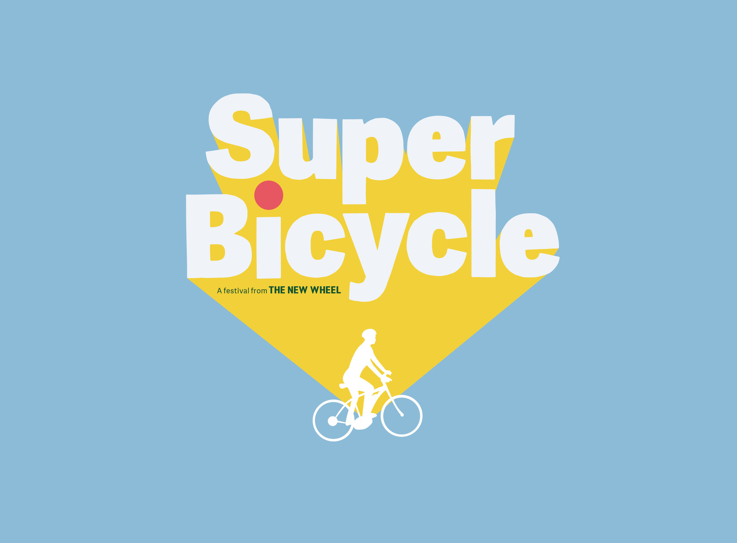
Simple and applied versions of the wordmark.

I love creating a family of designs, so after designing the required poster and postcard, I threw in some bonus designs: t-shirt, stickers, enamel pins.
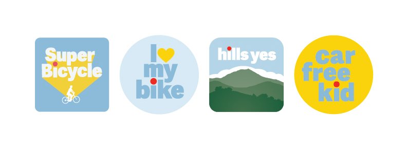
Sticker/enamel pin designs.

T-shirt design.

11" x 17" poster design.
Next, read about data visualization work that I did for Strava.